Project Description
The Retail Installation serves as a testament to a multitude of capabilities and diverse experiences meticulously curated through dedicated time and effort. At its core, the installation offers a captivating experience, beginning with the activation of four compelling motion graphic videos through the scanning of QR codes on a large screen. In addition to this central feature, the installation boasts three supplementary stations: an interactive catalog, a rotating product display, and a touchscreen ordering station. Each of these stations is meticulously designed to offer patrons a seamless and engaging interaction with the brand.
Role
As the User Interface designer for this project, my role revolves around crafting intuitive and visually captivating interfaces that seamlessly integrate with the Retail Installation. I'm tasked with conceptualizing and designing user-friendly experiences across all stations, ensuring that each interaction is intuitive and engaging. From developing interactive catalogs to designing motion graphics screensavers, I work diligently to create a cohesive and immersive journey for users.
Project Specification
The project harnesses the power of several cutting-edge technologies to deliver an exceptional user experience. HTML provides the foundation for structuring web content, while CSS stylesheets ensure visually stunning presentation across devices. JavaScript adds interactivity to the application, enabling dynamic content updates and user interactions. GSAP (GreenSock Animation Platform) enriches the user experience with fluid animations and transitions, enhancing engagement and aesthetics. By leveraging this tech stack, the project achieves a perfect balance between functionality, performance, and aesthetics, setting a new standard retail installation application.
Interactive Catalogue Station
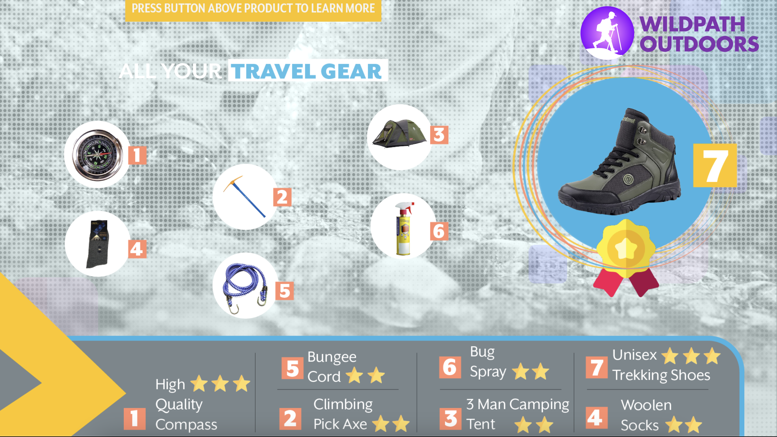
At this station, an innovative input device resembling a standard computer mouse offers a unique interface experience, albeit with some distinct functionalities. Positioned at the Interactive Catalogue, a flat screen monitor showcases a screen saver providing insights into interaction methods and instructions for utilizing the motion sensor product display. These instructions persist until the user initiates action, with promotional elements prompting engagement. Notably, the screen saver reactivates after a designated period of user inactivity, resetting the interface.
Customers can seamlessly navigate the catalogue by following on-screen prompts, selecting desired products from specific collections. Upon choosing a product from the display and triggering the sensor with exposure to light, a new screen unveils product images and relevant details, accompanied by further guidance. To delve deeper into the featured product, users can press a designated button located behind the selected item. This alternative shopping approach streamlines product selection and enhances user efficiency, fostering a more intuitive and seamless shopping experience.

Rotating Product Station
This station presents an inventive approach to augmented reality, utilizing an alternative device for product viewing. At the Rotating Product Station, users are greeted with an animated screen featuring concise descriptions and instructions for device usage. Following instructional cues from the animated tutorial, users engage with the product displayed on the screen. It's important to note that the screen saver reactivates after a designated period of user inactivity, resetting the interface.
Offering a comprehensive 360-degree view of the backpack, the station emphasizes key information and details from various angles and sections. Interaction is facilitated through the gesture-controlled app, Leap Motion, empowering users to navigate screens and access information solely through hand movements. This feature caters to users seeking touch-free interaction, particularly valuable in maintaining hygiene protocols. Specific gestures unveil additional product insights and facilitate navigation between screens, while highlighting key features throughout the rotations.
Immersive and captivating, this station showcases a pioneering utilization of technology, promising an engaging and innovative experience for users.

Touchscreen Ordering Station
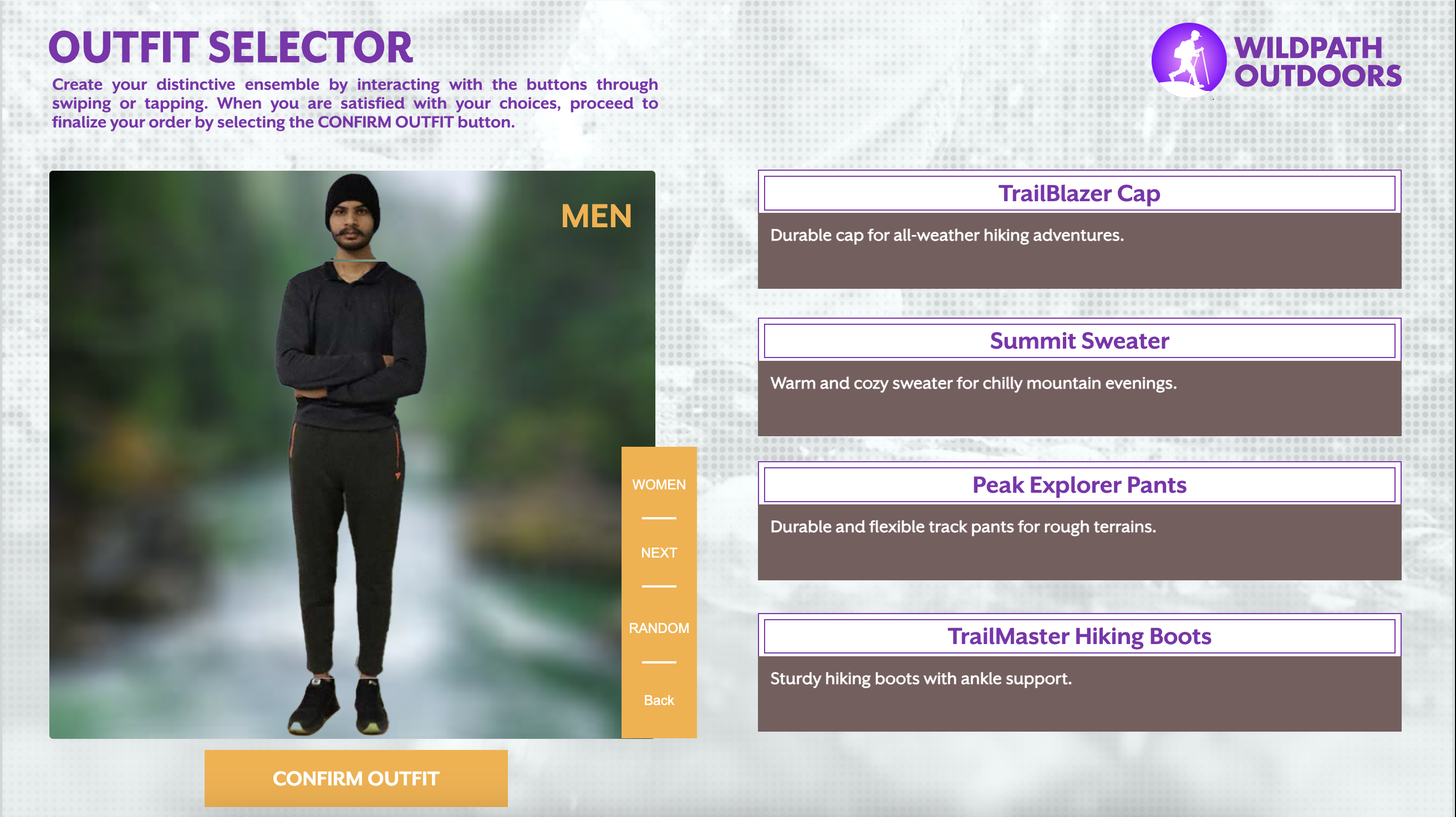
While the Touchscreen Ordering Station may seem more conventional compared to its counterparts, its sophistication and relevance in today's digital age are undeniable. This station revolutionizes the shopping experience, allowing users to effortlessly browse through a myriad of clothing items until they find the perfect outfit. Fashion-forward motion graphics grace the display screen, showcasing garments and providing essential information to entice users. Clear instructions for initiating the browsing session remain visible on the screen at all times, with the screen saver reactivating after a period of user inactivity to maintain a seamless experience.
Users are treated to a virtual fitting room experience, with a diverse array of clothing options displayed on human models, enabling them to visualize how each outfit would look when worn. Detailed information such as color, size, and features of each item is readily accessible, empowering users to make informed decisions. Once the desired outfit is curated, users can easily generate a receipt and proceed to the cashier to collect their chosen items.
The Touchscreen Ordering Station not only streamlines the shopping process, saving time and effort, but also minimizes physical interactions and contact points, aligning with contemporary health and safety protocols.

Motion Graphics Video
This captivating experience seamlessly blends three promotional videos into a single narrative, offering a glimpse into the brand and its flagship products available in-store. Designed to captivate potential customers, the continuous loop video showcases real-life interactions with the products, enticing viewers to explore further stations. Projected onto a surface using a short-throw projector, this station maximizes space efficiency while delivering a compelling visual experience.
A unique feature of this station is QR code scanning, offering an interactive element where users can scan one of three QR codes to access corresponding videos. Prior to scanning, a simple branding video plays continuously, setting the stage for the immersive journey ahead. This multifaceted approach ensures that each user engagement is dynamic and tailored to their interests, ultimately fostering deeper connections with the brand and its offerings.
Branding Guidelines
The installation's creation coincided with the conceptualization of the brand identity. Dubbed "Wildpath Outdoors," the brand name embodies the essence of exploration and adventure inherent in the project's theme. "Wildpath" evokes images of traversing untamed landscapes, aligning perfectly with outdoor activities such as hiking. The logo design features a directional motif seamlessly integrated into the wordmark "Wildpath," symbolizing the journey and pathfinding spirit of outdoor exploration. Beyond mere aesthetics, the branding carries a profound concept, serving as the primary identifier that resonates with audiences and sparks conversations.
In line with the brand's ethos of simplicity and clarity, the branding elements are kept minimalistic. Dotted lines subtly accentuate the sense of direction, both within the installation and across other brand collateral. The main color scheme is carefully selected to complement and highlight essential elements, ensuring a cohesive and visually appealing design aesthetic. This deliberate approach prioritizes legibility and impact, ensuring that the branding remains memorable and easily recognizable to all who encounter it.
View Brand GuidelinesThe Process
